
I still owe to the Forum the announced screenshots about a comparison of the new user interface with the classic UI.
While I'm a bit younger, I also loved the previous scrollbar very much — as well as the overall unobtrusive interface with just the right amount of slight textures, borders and shadows, in all places where they're useful and pleasing to the eye.
PDF-XChange Editor is not only clearly the best PDF software in the world, but in my view also one of the best designed, fastest and most effectively coded software programs anywhere — hats off to your world-class developer team. Until recently, PDF-XChange Editor also had one of the most beautiful and most efficient user interfaces ever, in my opinion — a design that was thus totally consistent with the software quality.
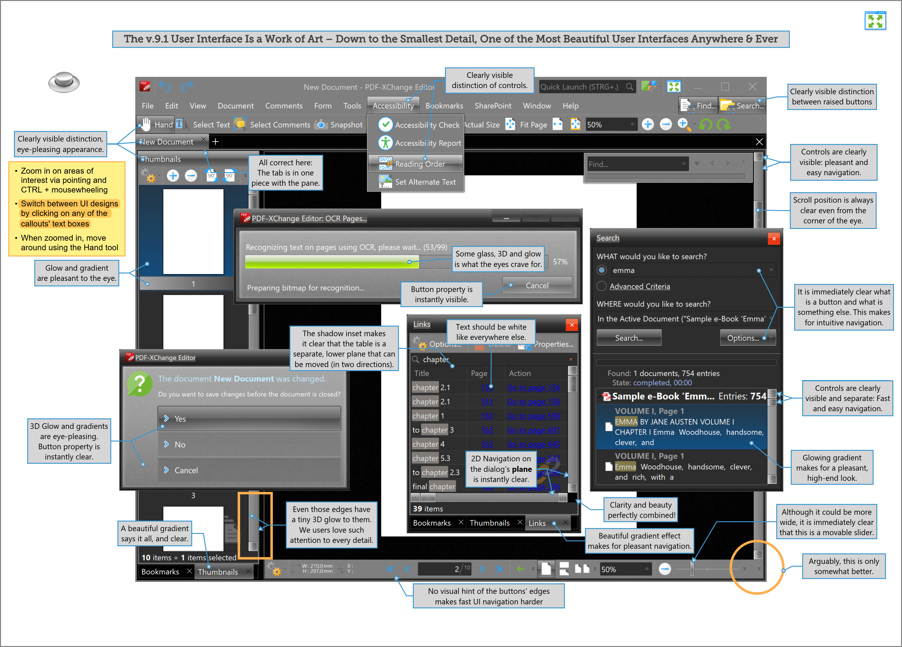
Unfortunately, with the latest design update, some user interface features have been lost, especially many of the beautiful textures, some of the visually very helpful 3D, shadow and inset effects that visualize, for example, the pressed state of buttons or the Z-order of certain window elements, and very regrettably, also the very effective and catchy scroll bars.
Regrettably, the new UI design also has the effect that the visual appearance of PDF-XChange Editor no longer matches its superior quality and leading market position as perfectly as the previous UI did — see the attached PDF comparison document.
By the way, we professional users not only love the functionality of our favorite software, but we also love to see some eye candy applied to the razor-sharp high-end tools that we use on a daily basis.
https://forum.pdf-xchange.com/viewtopic.php?f=62&t=37479&hilit=tools#p155026
Further, the argument that a subtly realistic looking scroll bar distracts from the content of the document and therefore should be decomposed and made as rudimentary as possible cannot hold.

The human eye inherently has the characteristic of barely perceiving anything outside the central focus anyway. However, this certainly does not mean that everything outside the central focus of the eye should be faded out or made as rudimentary as possible.
After all, as soon as the eye's focus shifts from a PDF's content to an element of the user interface, this element of course should be as meaningful, intuitively understood and as easy to use as possible — and all this not only after you've moved the mouse over it.
Unfortunately, this is not the case with many of the elements of the new UI, especially and including the new scrollbars. Not only is their position barely visible out of the corner of the eye (in order to provide information about where you currently are in the document). The new scrollbars are also significantly more difficult to hit with the mouse — although admittedly being just as wide as the classic scrollbars, technically. However, this is something you don't keep in mind all the time, instead you keep trying to hit that narrow scrollbar strip time and again

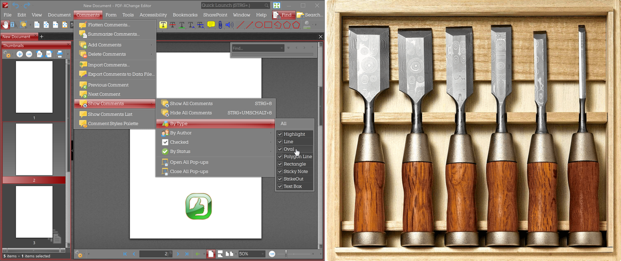
Long story short, below and attached is my long-announced screenshot comparison. For easier switching between new and classic user interface, I have assembled all screenshots into a PDF with two pages.
In order not to scare anyone when opening the PDF, the screenshot below shows what the attached PDF looks like. Because of the relatively large number of elements and dialogs shown, the pages are rather packed.
For best results when comparing the UI parts of interest, it is recommended to open the PDF (in full screen mode), to point with the mouse to a respective area of interest, and then to zoom in as much as desired by using CTRL+mouse wheel.
It is then possible to switch between the current and the classic user interface in the PDF by simply clicking on any of the text boxes (callouts).
Lastly, regarding my background as a professional user of PDF-XChange Editor for over a decade, I may mention, and it is a great honor having suggested, inter alia, the following current features of PDF-XChange Editor:


Thanks very much,
Kind regards,
David.P
--

