New look of the Board - and how to change it
Posted: Sat Mar 25, 2017 12:11 am
Hello,
first of all let me clarify that the following comment is not at all meant polemical and that I appreciate the friendly and excellent support we get here in this Board by all the staff (and by some ordinary members as well).
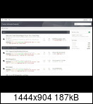
Nevertheless I must say that the new look of the Board is terrible. And with "terrible" I do not simply mean some aesthetic concerns (which are always quite subjective) but mainly the readability (and so the usability) of the Board (and its Forums). It is extremely strenuous and tiring for the eyes to look at a skin that does no longer have different colours, no letters in bold, no clear boarders/lines (between different posts or other parts which should be separated), but fonts which are too bright so that it is difficult to read them etc. etc.
I will show you an example. It is the board index, as it appears in two different styles:
a) with the new style:
b) with an alternative style (which seems to be on the whole the style as it was before the change):
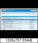
No one can convince me that the new style is more pleasant for the eyes than the second one.
So I would like to raise a question (and as I mentioned above, it is not meant as provocation but based on honest interest):
Why are styles as the new one used so often in the last time? (The Tracker Board is by no means the only one. You can find a similar look in various other boards too and also in the user interface of various software.)
Is it simply a matter of fashion, an attempt to be trendy? Or does it have some clear practical reasons (for example the readability on mobile devices or something similar)? It would be really interesting to know.
And finally (as this is a "How to Forum" ) an advice for visitors like me who are not happy with the new appearance: You can avoid it (but you have to log in and you must stayed logged in order to use it):
- Click on your user name (in the upper right corner) and choose from the drop down menu "User Control Panel"
- Click on the tab "Board preferences"
- Under "Global settings" you have an option "My board style": Here you can choose an alternative style (the one in the above second picture is "prosilver").
- Then don't forget to click on "Submit".
Sorry again for my post. But until now I did not find some comment about the new look. So I decided to write it.
first of all let me clarify that the following comment is not at all meant polemical and that I appreciate the friendly and excellent support we get here in this Board by all the staff (and by some ordinary members as well).
Nevertheless I must say that the new look of the Board is terrible. And with "terrible" I do not simply mean some aesthetic concerns (which are always quite subjective) but mainly the readability (and so the usability) of the Board (and its Forums). It is extremely strenuous and tiring for the eyes to look at a skin that does no longer have different colours, no letters in bold, no clear boarders/lines (between different posts or other parts which should be separated), but fonts which are too bright so that it is difficult to read them etc. etc.
I will show you an example. It is the board index, as it appears in two different styles:
a) with the new style:

b) with an alternative style (which seems to be on the whole the style as it was before the change):

No one can convince me that the new style is more pleasant for the eyes than the second one.
So I would like to raise a question (and as I mentioned above, it is not meant as provocation but based on honest interest):
Why are styles as the new one used so often in the last time? (The Tracker Board is by no means the only one. You can find a similar look in various other boards too and also in the user interface of various software.)
Is it simply a matter of fashion, an attempt to be trendy? Or does it have some clear practical reasons (for example the readability on mobile devices or something similar)? It would be really interesting to know.
And finally (as this is a "How to Forum"
- Click on your user name (in the upper right corner) and choose from the drop down menu "User Control Panel"
- Click on the tab "Board preferences"
- Under "Global settings" you have an option "My board style": Here you can choose an alternative style (the one in the above second picture is "prosilver").
- Then don't forget to click on "Submit".
Sorry again for my post. But until now I did not find some comment about the new look. So I decided to write it.